View Photos
Photos can come from different sources; you can aggregate them from Facebook, Picture Library, Skydrive, Flickr, and the likes.
Going into each each “folders”, will yield the left and right rows of photos. You can pinch to view them in thumbnails for ease of access:
When viewing individual photos, you can use the pinch/zoom action to zoom out/in the photo.
Windows 8 App Store
The Windows 8 App Store is a smaller store than the existing Apple App Store and Android Play, but Microsoft is trying very hard to beef up the number of apps to make it a viable platform for people to download and use the OS platform. Looking at the top free list, we see the likes of fresh paint, Pirates love Daisies (5 stars game), Fruit Ninja, Twitter type of apps (MetroTwit, Tweetro etc). The store is organised into categories such as Social ,Games, Spotlight, Entertainment, Photo, Music and Video, Sports, Books and References, News and Weather, etc.
First impression of the app store, is that it is not a fast app store, requiring frequent loading and preparing before the apps appear on-screen. So that dampened the app selection experience. Waiting for more than 3 seconds or more is a no no for most consumer. And this was done on a fiber network connection with more than 25mbps of bandwidth both directions.
Taking a look at the top free 100 apps, we see quite a number of useful applications available. 🙂
Conclusion
Windows 8, in my opinion, is Microsoft’s brave, but poor attempt to dovetail their Desktop OS into a tablet environment. Have they succeeded? I have doubts.
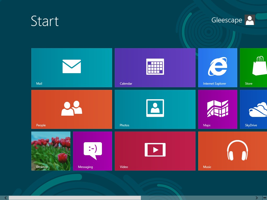
First, the Metro GUI and interface (Score 3/5)
The Metro UI was different; it takes some time getting used to, and it seemed to feel more touches/clicks are required to get what I want to do done. Charms menu needs a swipe, a click and a selection to get where you want. Back buttons are sometime missing in some GUI, and I was unable to go back to the previous GUI screen. Task management is achieved by swiping from the left edge. Context menu is achieved by swiping from the bottom up, for the options. Am I used to it? In the time I was holding the tablet in my hand, I feel a little lost, trying to get to the different part of the application and guessing what is in the context menu (bottom swipe) and what is in the setting context (right swipe). In my opinion, the back button needs to be available in the app for any page, so user can back out to the main page. Yes, it is simple in look, but not simple in use. Options are not obvious to the user. There is the charm, and there is the context menu, and what else do I need to know to even use the UI effectively? Ok, perhaps I am too strong here; I have not used it for long enough to be familiar with the UI. So take this with a large pinch of salt. I wish you well, if you would like to familiarise yourself with the UI.
Second, the Windows 8 App Store (Score 1/5)
This is one small and slow app store, and it really need to relook at the way apps are presented to a consumer. I was not attracted to surf the store for apps. Traversing from one page to the other was painfully slow, with a white screen and the swirling dots for most part of my experience, and a lot of waiting (some even 5 seconds or more?). When I do managed to install the apps, sometimes the app does not launch, sometimes it did not install correctly. What am I doing wrong? I am just using the app as a layman, the man on the street. To search for an app, I had to try my luck by bringing up the charm bar by swiping from right, select Search, and then key my search term in there. This is way too much trouble; and this comment is coming from the mouth of a tech-savvy enough consumer. What would a normal less savvy consumer do? They will give up finding the search. Simple as that. Microsoft folks need to hear this.
Integration with others (Score 3/5)
I am not sure what is the intention of Microsoft’s current service connection design, but somehow I felt lost while trying to connect the Windows 8 to Facebook, Twitter or some other social applications. The association process/concept was a little filmsy and inconvenient. I had to first get a Windows account (live, hotmail etc), and then somehow link that account to another Facebook, Twitter or other app some where. The connection process feels disconnected. Sometimes, I don’t even know which account Windows 8 is asking of me – the Windows account, or the calendar or mail account I want to connect to, or the Facebook account I want to link to. Hopefully, this will become clearer in the future, and I hope in a single GUI, I can know which services I am connected to, and easily connect/disconnect/sync these services.
Conclusion
When you want to be everything to everyone, it is a tiring thing to do. When an OS tries to be everything to everyone, it really messes up itself. Think of it as a schizophrenia-type of behaviour. I believe when you try to achieve success in everything, you may potentially end up with mediocrity in all things. I really hope Microsoft’s Windows 8 strategy is not this, but it seemed to be going that way. I know a lot of hard work has gone into this. But frankly, I don’t connect with the new OS. I simply don’t. As a techie person, who has used Android phones and tablets, Windows mobile phones, Windows desktop OS, from the venerable MSDOS through Windows 3.1 through Windows 8, as well as iPhone and iPads, I am not sure this Windows 8 offering will work out for Microsoft in the short and medium. With the benchmark of usability held high by Apple’s IOS, and the increasing popular and open Android platform for the tablet/phone ocean, Windows 8’s chances of breaking into that market looked alarmingly slim. And if in the short term it does not take off, I doubt it would ever do.


