Windows 8 was recently made available for public purchase and download, and boasts a new tiled, touch-friendly interface as well as enhancements to the good old traditional mouse+ keyboard combination that we are so used to. So what is new in Window 8? Should I move to Windows 8 if I am on Windows 7 now?
Microsoft’s new iteration of the Windows operating system is very much focused on a tiled interface for touch-enabled devices such as tablets. And this new approach is contentious: Some people think that is it still somewhat usable with a mouse and keyboard, while others think it’s a step backward. Others who adopt a more balanced view would say that it is a good thing that you can switch between the simple “metro” interface and the normal Windows desktop, depending on what you need. Personally, I would like to think of it as “docked” and “undocked” usage scenarios. When docked, I want to connect to a full-fledged desktop device, completed with high productivity peripherals such as large screens, keyboard and mouse. When undocked, I want a touch friendly tablet device with good battery and connectivity options. I’d say that the new Windows 8 does meet those scenarios I briefly described to certain extents.
User-Friendly Lock Screen
The lock screen on Windows 8 allows you to put a a beautiful picture of you choice, with that, a dash of little widgets telling you the time, number of emails you have received and stuff like that. Like most tablet, you can swipe to unlock, or press the space bar (if you have a keyboard connected). One interesting bit about the Windows 8 is the picture password feature. You can design a series of gestures on the lock screen picture that only you know and by repeating that secret gestures (with the picture as the guide), you can then login to the OS. When I was reviewing the OS, I just have to tap on three pairs of feet in my picture and presto, I am in!
Better Performance that Windows 7
Windows 8 seemed to have been optimised by Microsoft quite a bit. Not only have the new touch/tiled intefaces been added, that did not incur any performance hit. On the contrary, it seemed to have better performance than Windows 7. For example, boot times were found to be better than Windows 7 (which, btw is already pretty decent from the Vista-era).
 Tiled Experience in the “Metro” Interface
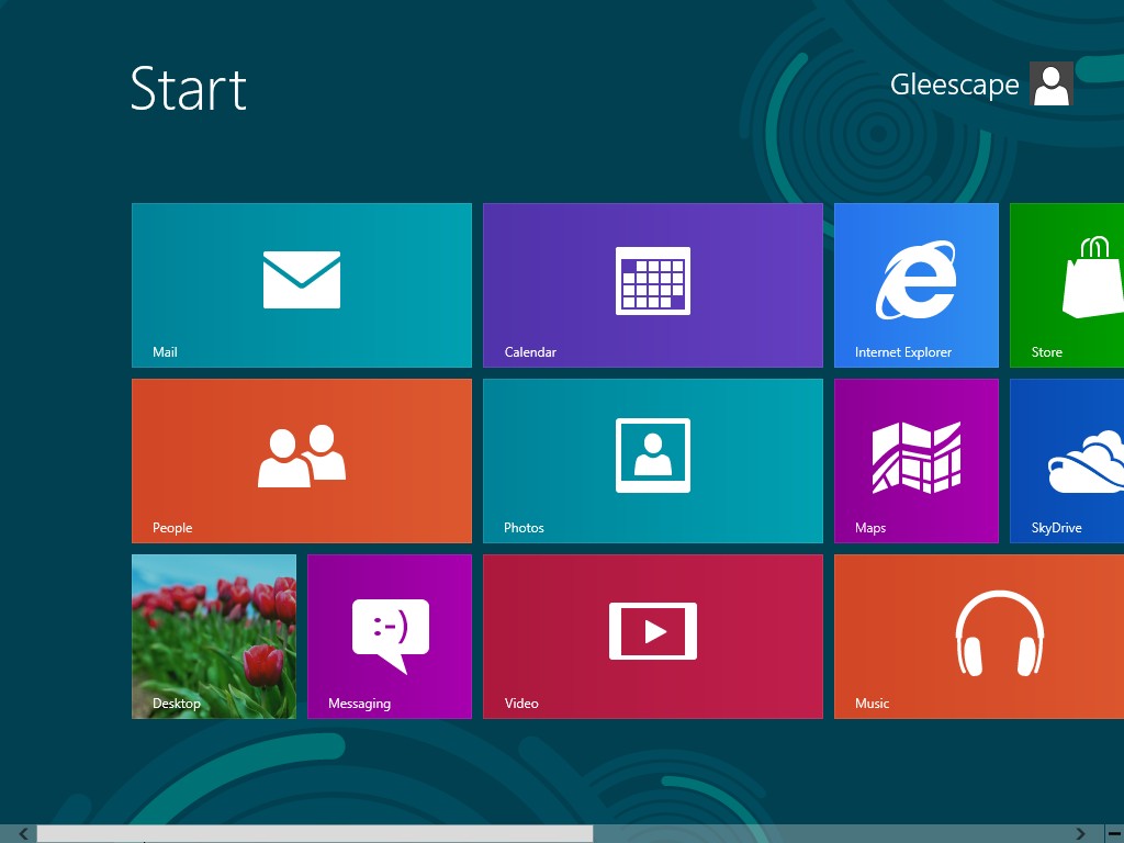
The new Windows 8 start screen is a tiled interface and a departure from the usual Windows desktop look. You will see many tiles (like in the Windows phone). Each tile will represent an application. Since they are so-call “live”, they will show information and notifications that are relevant to the application. For example, the email tile will tell you how many unread emails you have, the calendar tile will show upcoming calendar events and meetings, your favourite social media tile will show you new notifications, and so on. Oh yes, tablet applications usually runs in full screen, so that’s a good thing. I found that with touch-based usage, window buttons are just too small, and screen estate is key. Hence, full screen app is a good change! =D
 The Windows Desktop 8 (without Start button!)
This desktop mode is something you will be very much familiar. The standard taskbar, desktop icons, and the normal windows applications. One thing though – you will sorely miss (well I did!) was the removal of the start menu. Personally, the removal of the start button was painful for windows users like me. But with some practice, I could get things done most of the time – albeit more inconvenient and frustrating. I guess there is a learning curve to this. You can press the Windows button and typing in app or a setting to search for it. For me, a shortcut of Win+X key will bring up a small “modified” menu with shortcuts to the Run, Control Panel, Command Prompt, and other functions that I would like to access.
 Slightly Changed Windows Explorer and Task Manager
There are some slight changes to the Windows Explorer. The “Ribbon” interface is the new explorer interface with Home, Share, and View. Personally, I prefer the good old explorer style, but some may disagree.

 Shopping for Application – Windows Style
The Windows Store is where you can buy new applications or download free ones. The interface is also a tiled one, so it is a consistent experience. So this is a new way for Microsoft to deliver software to your desktop, very much like the Google Play and Apple store.
The Move to the Cloud
As with many platform nowadays, cloud is becoming the centerpiece of the user experience. In Windows 8, your Microsoft account will be the heart of the all the syncing. That means that your address book, photos, SkyDrive stuff, and even data within third-party apps can be synced to the cloud service, and you can access these data on any Windows 8 devices that you sign in to (including settings of Windows 8). The address book also syncs with apps such as Facebook and Twitter. While some people may love all these syncing, others may find the loss of control of what is stored where, and a sense of loss of privacy (the cloud is like a black box to many of us).
New Directions – New Beginning?
All in all, this new implementation of Windows 8 does bring about some new ideas from Microsoft. If this carry off well, maybe there is a chance that Windows 8 devices may become the default device to bring around. Think about this: one device to do all you need to do, both in the home and office, as well as one the move. Sound pretty good, isn’t it? In theory yes, in practice? It will depend on individual’s work flow and lifestyles. If you fancy the all in one concept, and the weight + performance + battery life equation works out to be excellent, Windows 8 would be indeed a welcoming change to the world of technology workers and citizens.


